Widget Color changes on Dashboard
Objective
Customizing widget colors on the Analytics for Contact Center dashboard.
Applies To
- Analytics for Contact Center
- Dashboards
Procedure
The user would like to have the Calls Abandoned widget display green if the abandoned calls are below 5%, amber if it is between 5.0% and 9.99%, and red if it is 10% or above.
The user would like the Average Handling Time widget to display green if the time is under 3 minutes 30 seconds, amber if it is between 3 minutes 30 seconds and 5 minutes, and red if it is over 5 minutes.
Our goal is to color the metrics in three different colors: Red, Amber and Green and to set the parameters accordingly.
Create Thresholds
- Log in to Analytics for Contact Center.
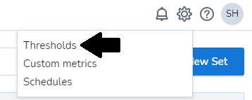
- On the Dashboards page, select Settings (gear icon) in the upper right corner.
- Select Thresholds.
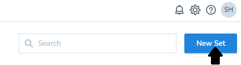
- If there isn't any threshold created, select New Set.
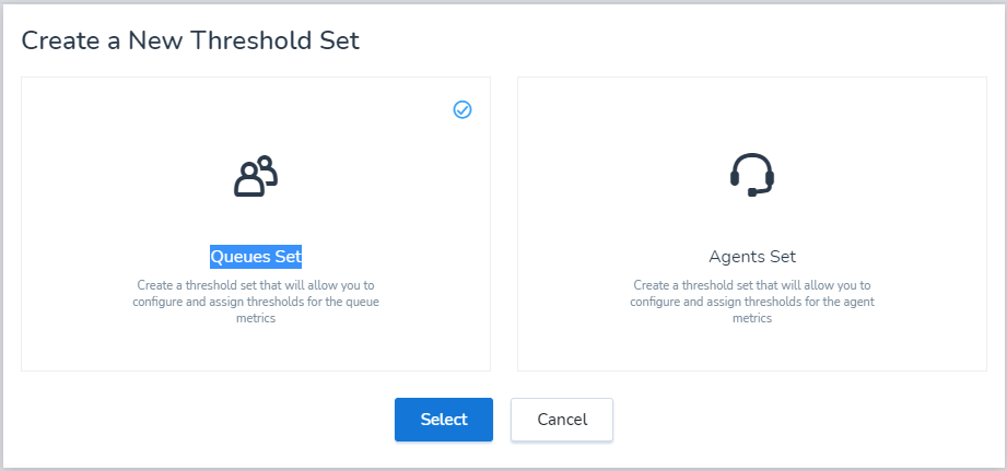
- In the new pop-up window, select Queues Set.
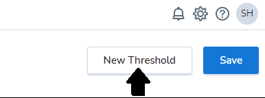
- In the next window, select New Threshold.
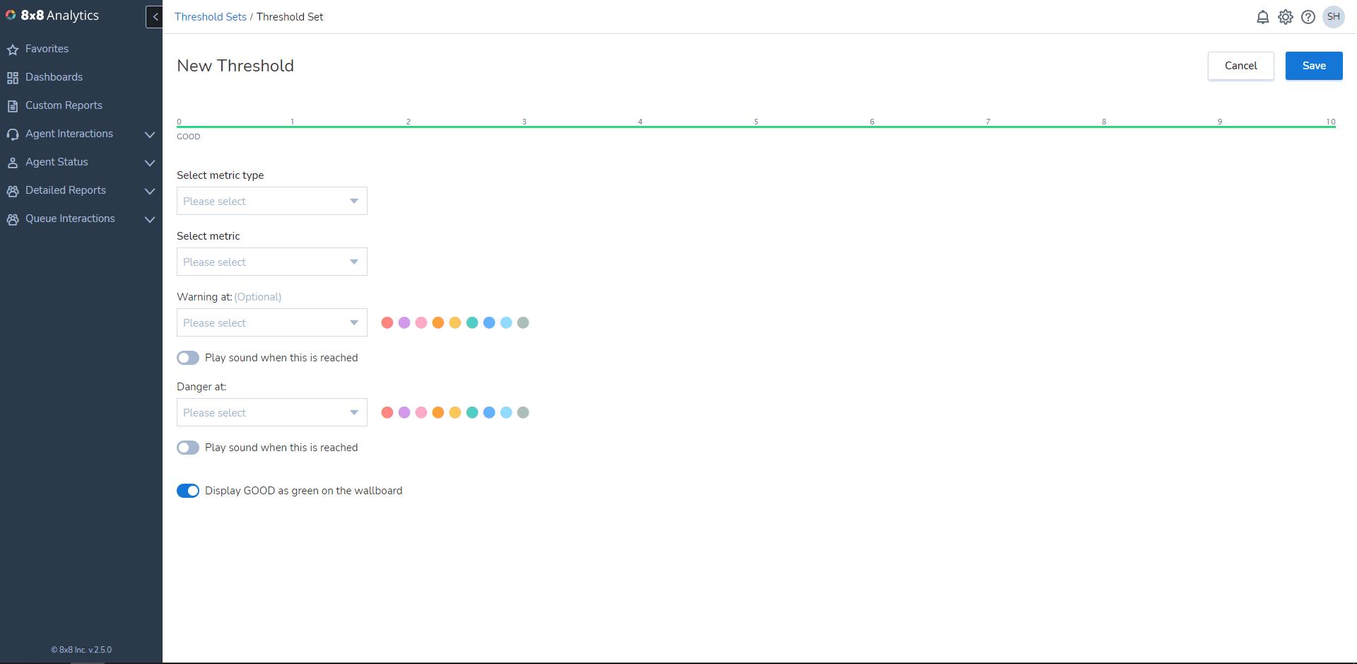
- A New Threshold page will open.
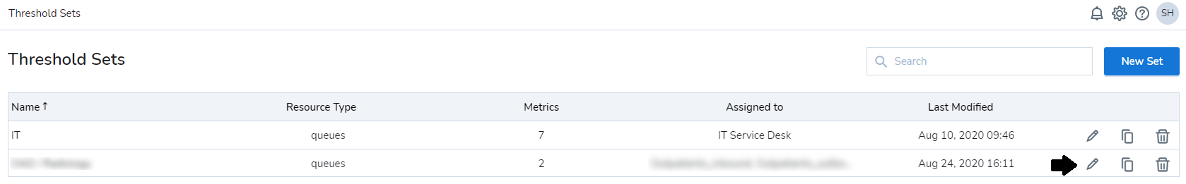
- If there are threshold sets already created, you can edit them by selecting Edit (pencil icon).
Calls Abandoned Widget
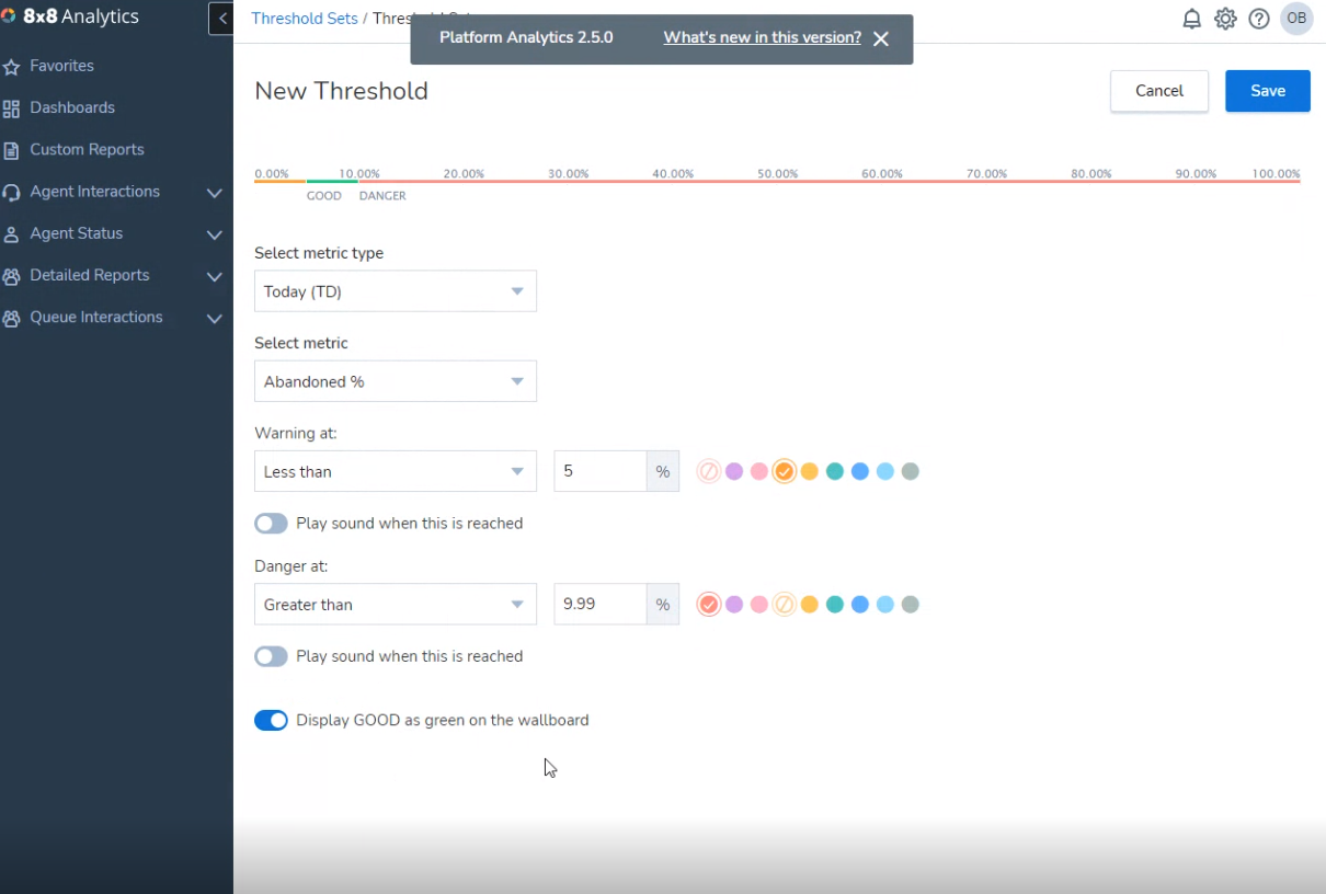
- Set Select metric type to Today(TD).
- Set Select metric to Abandoned %.
- Set Warning at: Less than 5% and select Amber.
- Set Danger at: Greater than 9.99% and select Red.
- Turn on Display GOOD as green on the wallboard.
- Select Save.
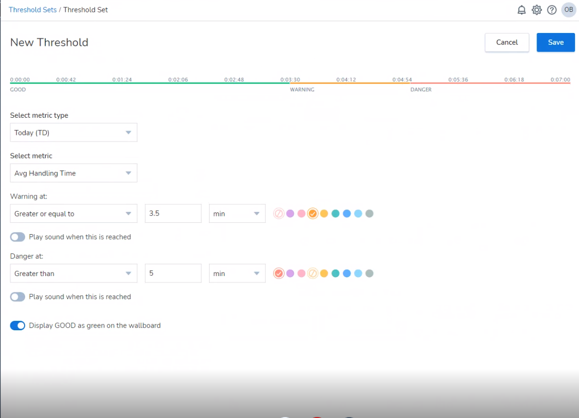
Average Handling Time Widget
- Set Select metric type to Today(TD).
- Set Select metric to Avg Handling Time.
- Set Warning at: Greater or equal to 3.5 min and select Amber.
- Set Danger at: Greater than 5 min and select Red.
- Turn on Display GOOD as green on the wallboard.
- Select Save.