Creating Visualizations and Graphs
Objective
Creating visualizations and graphs with Fuze Discover.
Applies To
- Fuze Discover
Procedure
Fuze Discover makes it easy to create graphics and charts based on your query results in an Explore. Discover keeps query details and visualization configuration data together, so when you share a query, recipients get both the visualization and the data.
Quick Start Guide
In an Explore, use the Visualization section to add an eye-catching chart to your query results.
- Create your query and click Run.
- Click the Visualization tab to open the Visualization options.
- Select the type of visualization that best displays your data.
- Click Edit on the far right of the Visualization tab to configure the visualization option settings. Optional settings include the following:
- Naming and arranging chart axes
- Choosing the position and type of each data series
- Modifying the chart color palette
Choosing a Visualization Type
After you create and run your query, click the Visualization tab in the Explore to configure visualization options for the query. Use the chart buttons to select the visualization type that best illustrates the queried data.
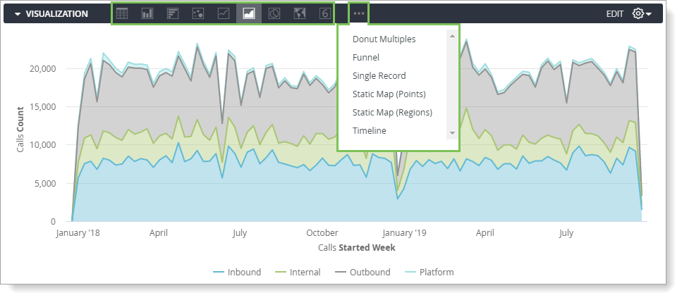
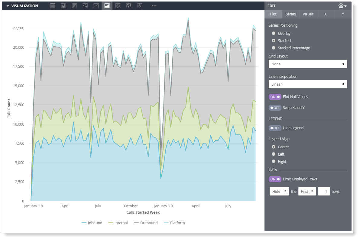
The visualization type that you select determines how the data series are represented in your chart. A data series is a set of related data points plotted on a chart. For example, the number of inbound calls placed each week using Fuze is a data series. In a column chart, a series is represented by columns of the same color. In the above stacked area chart example, each series is represented by a different colored area. A list of the series for your chart is displayed in the series menu and on the chart legend.
Fine-tuning Your Visualizations
Customize your visualizations with the following Discover features.
Customizing Visualizations with Chart Settings
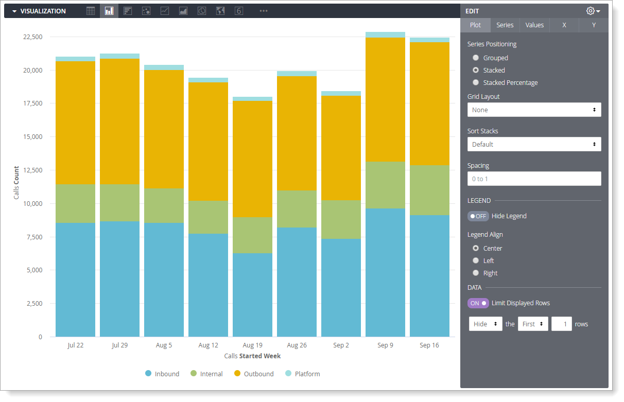
Customize a visualization to make the data more readable and to add visual styling. To access the visualization options, click Edit on the far right of the Visualization tab. The example below shows some of the visualization settings chosen for an area chart with Stacked series.
Including Multiple Visualization Types on a Single Chart
Create charts that include more than one visualization type to contrast data series values.
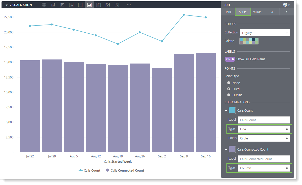
- Click Edit.
- Click the Series tab.
- In the Customizations section, there is an entry for each series in the chart. Click the arrow to the left of the series that you want to change to display its customization options.
- For Type, select the visualization that you want to use for each data series.
Charts with multiple series types always layer line and scatter series in the front. Area, column, and bar series are displayed on the back layer.
The leftmost series is layered on the top, and the rightmost series is layered on the bottom according to the chart legend at the bottom of the visualization. To alter the layering order of a column, bar, and area series, sort the series’ positions in the data table and click Run again.
Creating Stacked Charts with Multiple Visualization Types
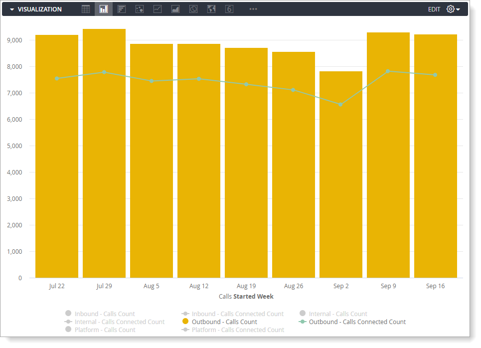
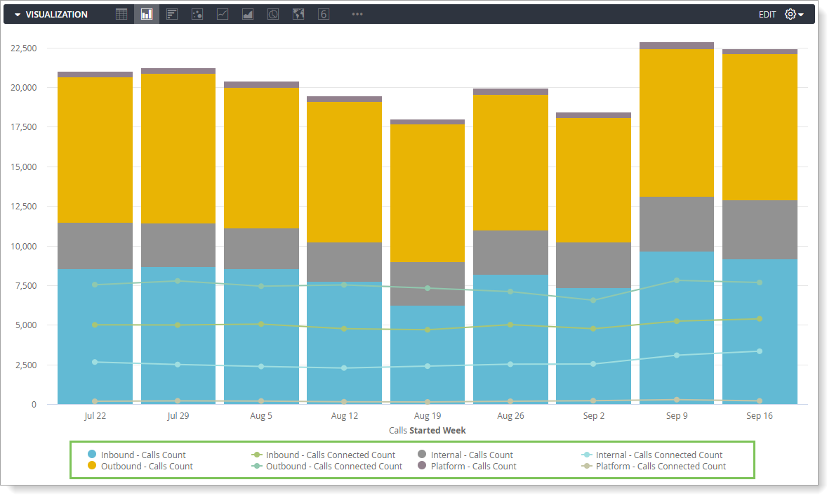
Include stacked series in a chart with multiple visualization types to drill into a data series while comparing it to another data series. All data series of the visualization with the same type as the overall chart stack together. For example, the chart below is a column chart. The columns stack together, but the line series do not stack.

To create a stacked chart that uses multiple y-axes, drag any series to a different axis in the Y menu.
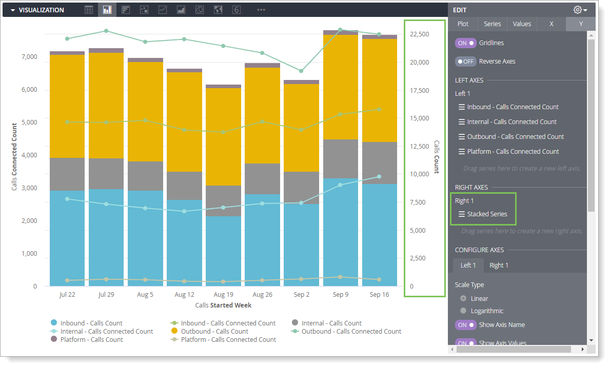
The stacked series is grouped together, but you can move the other series independently, including individual series within a pivot.
Specifying Which Dimensions and Measures to Include in The Visualization
All dimensions and measures are added automatically to any visualizations that you create. However, you may not want to display every dimension or measure in the visualization.
In the example below, note that the following dimensions and measures are displayed:
- Inbound - Calls Count, Outbound - Calls Count, Internal - Calls Count, Platform - Calls Count
- Inbound - Calls Connected Count, Outbound - Calls Connected Count, Internal - Calls Connected Count, Platform - Calls Connected Count
You can hide a dimension or measure from a visualization using one of the following methods:
- Click the gear icon in the column header in the Data section. Select Hide from Visualization.
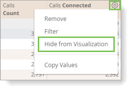
To unhide the series, click the gear icon and select Show in Visualization. - In the Visualization, click on the series in the legend. When the series is hidden from the visualization, the series color turns grey in the legend and the data is not displayed in the chart.
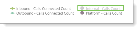
To unhide the series, click it again.