Exploring Data
Objective
Exploring data with Fuze Data.
Applies To
- Fuze Data
Procedure
Explores enable you to build ad hoc reports or custom Looks to supplement the prebuilt dashboard Looks. Explores provide tools such as Dimensions (i.e. data points), Measures (i.e. parameters), filters, and visualization options (i.e., bar charts, line charts) that you can use to analyze and present your organization’s Fuze-specific data.
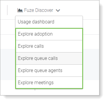
Currently, Discover includes Explores for calls, queue calls, meetings, queue agents, and product adoption.
Expand a section below to view detailed information about Explores and analyzing data in Fuze Discover.
Accessing Explores
You can access Explores in several ways.
To open a new Explore, select an Explore in the Fuze Discover menu on the home page.
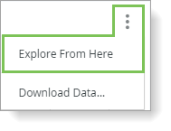
To open the Explore of a Look in the Dashboard, select Explore from Here in the vertical ellipsis menu.
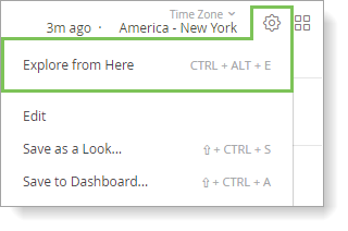
When viewing a Look that is not in the dashboard, select Explore from Here from the gear menu.
Working With Data in Explores
The data displayed in an Explore is determined by the Dimensions and Measures that you select from the Explore pane on the left side of the screen. A dimension is a data point, and a measure is the criteria you use to organize and quantify the dimension. When you select a dimension in the Explore screen, a blue column is added to the Data section of the Explore. When you select a measure, an orange column is added to the Data section of the Explore.
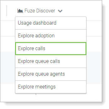
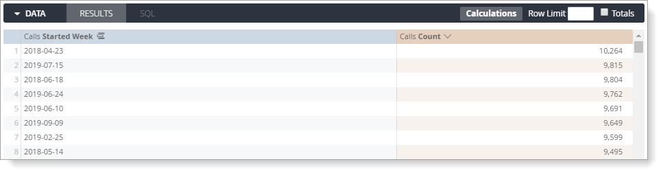
For example, imagine you are an IT Manager for a software company, and you want to know how many calls are made each week using Fuze. Follow these steps below:
- Use the Explore calls to analyze call volume data.
- In the Explore pane on the left, complete the following:
- Click Dimensions.
- In the Calls section, expand Started Date and click Week.
- Click Measures.
- In the Calls section, click Count.
- Click Run in the top-right corner. The Results tab in the Data section displays the number of calls made per week with Fuze.
Adding More Dimensions For More Detail
Expand your query to learn more about each call made during the week. How many calls are inbound versus outbound? How many are internal? How many are platform interactions? To query this information perform the following:
- Click Dimensions.
- In the Calls section, click Direction.
- To view the query results, click Run in the top-right corner of the screen.
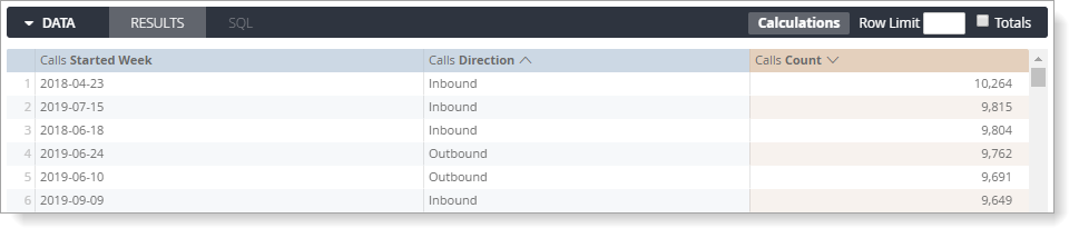
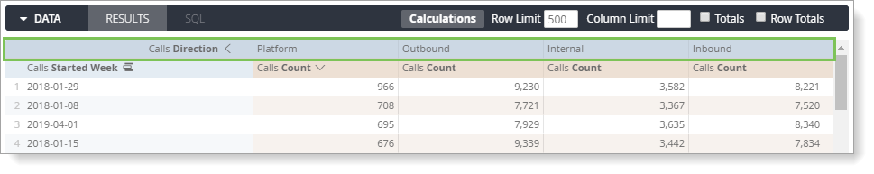
A new blue Calls Direction column is added to the Data section.
Sorting Data
To see which call direction experiences the most volume on a weekly basis, click on the Calls Count column header to sort from highest to lowest. If a column is sorted from highest to lowest, a down arrow is displayed next to the column name. If a column is sorted from lowest to highest, an up arrow is displayed next to the column name.
To sort by multiple columns, press and hold the Shift key, then click on each column header in the order that you want to sort the data.
If you query returns a number of rows that exceeds the Row Limit , you cannot sort row totals or table calculations.
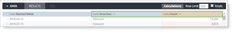
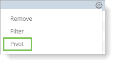
Pivoting Dimensions
Pivot a dimension to make the information easier to view and reduce the need to scroll to find data. When you pivot a dimension, each value in the dimension becomes a column in your Explore.
To pivot a dimension, click Pivot for that dimension in one of the following areas:
- The dimension row in the left Explore pane.
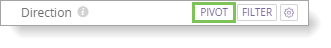
- The gear menu, accessed from the dimension column header.
Before you click Run, confirm that you included at least one unpivoted dimension and at least one measure. You can pivot additional dimensions as desired, but you must always include at least one unpivoted dimension. You cannot change the order of the pivoted dimensions after they are added to Data.
Rows that return invalid or empty values contain a Ø (null symbol).
You can also sort pivoted dimensions by clicking the title of the dimension. To sort by multiple pivoted dimensions, hold down the Shift key, then click on the dimension titles in the order you want them sorted.
When sorting a pivoted measure, any rows with values in that column are sorted first, followed by rows that contain Ø.
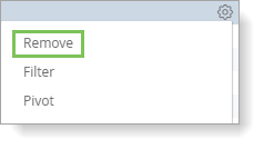
Removing Fields
To remove a field from your Explore, click the highlighted field in left Explore pane or select Remove from the column’s gear menu.
You can also remove all fields in an Explore using the keyboard shortcuts Command-K (Mac) or Ctrl+K (Windows).
After you remove fields, click Run to get the new query results.
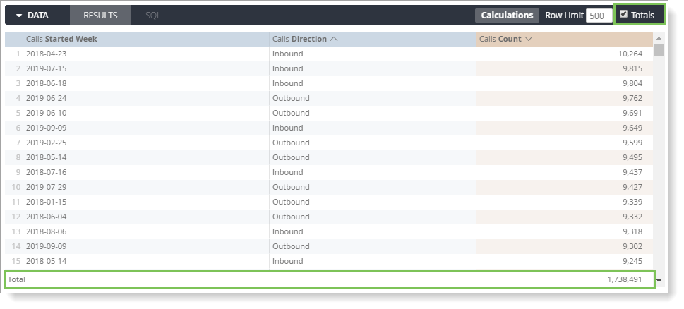
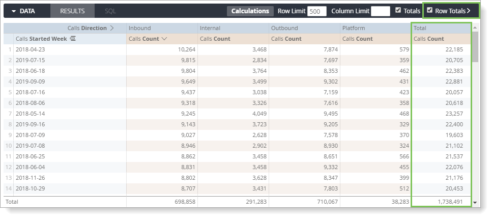
Displaying Totals
To summarize numerical Measures column data, click the Totals check box on the right of the Data tab to add a Totals row to the bottom of the results. Then, click Run.
To add row totals to your report, click the Row Totals check box in the far right of the Data tab. Then, click Run.
To add row totals, you must have a pivoted dimension in the report.
If you add row totals and the number of rows that your query returns exceeds the value entered in Row Limit, you cannot sort the Totals column because your row limit might not include rows that are required to calculate the total. If this occurs, increase the Row Limit value up to 5000 rows.
You can sort dimension and measure columns regardless of the Row Limit value.
Additionally, consider the following when working with totals in Fuze Discover:
- Columns that count unique items might not calculate the total as expected since the same item might be included in several queried categories, but only counted as one unique item in the totals.
- Some table calculations that perform aggregations calculate totals using the values in the total row, not using the values in the data column. For example, calculations using percentile or median might not add up as expected.
- In some circumstances, if you filtered your report by a measure, the total may seem incorrect. This is because the total is calculated using unfiltered data. Your report displays filtered data only, but the total displays the unfiltered amount.
- If you placed row limits on your report, but the report data exceeds that limit, the totals may seem incorrect. Your report displays data before the limits are applied, but the data that is displayed outside the report limits is included in the total.